
Vanderbilt HealthOps

For this project I served as Lead designer and prototyper. I worked wit a design implementer and doctor for data insights.
Volume is increasing—efficiency isn’t
In an emergency room environment efficiency is key for helping patients and doctors move through a hospital. Can we centralize data that exists in the system to increase output?
Working with a design integrator and emergency room doctor we identified metrics we could capture and display for use by the charge nurse to identify problem areas with live data. We could then capture that data for modeling.
Our hypothesis
By creating an interface on a physical device in the emergency room with tolerances for in-spec and out-of-spec metrics based on doctor and charge nurse input, we can provide live feedback to increase efficiency.
solution: actionable live data, dashboards
Because there are so many areas that can give us unique efficiency insights with the data we gather, we had to come up with a simple solution to show the information within those areas that was both easy to organize and understand. We did this by inventing a ‘Card System’. Each Dashboard represents an area of the hospital, department, or area. Each Dashboard is comprised of cards. A Card represents the metric (or metrics) within the area defined by the Dashboard.
Additionally, each of the cards depicted in Figure 1 have their own completely customizable target values for each metric shown. A card, as a whole, will only go out of spec when all of the criteria are either met or exceeded within each metric measured.

Figure 01. Dashboard data focus areas gathered from staff

Dissecting the data
‘Cards’ display a single metric in 3 sections. The first is the current value, the second is the queue for the original metric and the third is the projected speed at which the metric is optimized. Cards are combined into logical groups (dashboards) and at all levels tolerances are established for in-spec/out-of-spec views.
fundamentals: Horizontal linear meter
Figure 2 is a rendering of a card that is designed to go completely out of spec (indicated by the whole card turning red) when the projected speed is low, the queue is high, and the current value is low.
A real world example is if there’s a lot of people in the waiting room, there are beds available and there’s little activity in placing patients

Figure 2: Early wireframe applied to the data from table in Figure 1. This card type is called a ‘horizontal linear meter’
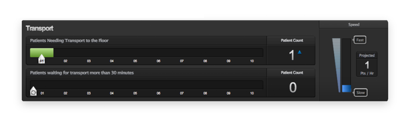
Figure 3: Horizontal linear meter beta

Figure 4: Horizontal linear meter with the entire card out of spec
Establishing a timeline
Whenever a card goes out of spec, you’ll notice a couple of things: First, the card starts to pulsate red and second a little yellow badge in the top right hand corner turns on showing the amount of time the card has been that way. We do that for a few reasons: to send notifications, to identify problem areas quickly, and to help to establish relationships. There are two ways to show relationships – the first is retrospectively through a reporting app for administrators or secondly on the frontend as things happen.
What HealthOps is a combination of the two – we have the backend component for administrators, but we’ve also invented a way to visually identify problem areas and their relationships. ‘Timeline’ is in it’s own Dashboard, but shows things in a slightly different way.
Each timeline card represents 1 dashboard. Within each timeline card there is a list of all of the elements of all of the metrics (Cards) being measured by the dashboard.

Sample timeline data concept

Timeline card beta
Labs: Where the action lives
Whenever a lab goes out of spec, it’s important – not only in terms of getting a patient the care they need as quickly as possible and for maximizing patient throughput- but for what it can mean for other patients. With Heat Map, we take into account lab values for a specific room and couple them with additional metrics like the number of rooms a nurse has in their area, occupancy, transport, and what’s going on in terms of the types of patients in the ED – and we apply all of these to a birds eye view of the department.
A Heat Map creates a cross-section or overhead view of the department. Each room is clearly identified with room number as well as a basic monitoring color of what the state of the room is. Similarly, each room can go out of spec and therefore notify the appropriate personnel of the problem.
Heat Map Card UI Beta
Each Heat Map card is composed of rooms. Each room has several metrics tied to that are specific to the type of patient who has been admitted to that room. Any administrative user has the ability to click or tap on the room of their choosing to see what labs are ordered, who the clinical care team for that patient is and individual cards for that patients’ course of care. As a default, only the rooms that clinical teams are directly involved with (ie- Signed up for or were assigned) are clickable unless they’ve been given access to all other rooms. Once a room is clicked, as with any other live metric card, users have the ability to receive a notification of the completion of that task.

Heat Map interaction wireframe when a user taps on a room from the dashboard

Screenshot of the Heat map dashboard live
Establishing tolerances with rules
When a card goes out of spec we send out a notification automatically, but it doesn’t end there. We’ve approached the concept of notifications in a simple way: notification stories.
Anyone who has access to HealthOps can set up notifications for themselves for when specific values are reached, and can be assigned notifications from administrators.
To do this we simplified the notification system – By allowing users to select from a variety of simple menus things like card name, gauge value, time period when it happens, where to send the notification, and resend time. We automatically populate a notification that is easily understandable as a sentence example:
“On the CARD NAME when the GAUGE reaches VALUE for TIME send a notification to my NOTIFICATION TYPE and if nothing changes, resend at TIME”
Taking Figure 1 as an example, a user could set up a notification for Triage using our system that says this:
“On the Triage Card when the ‘Patients Needing to Be Triaged’ gauge reaches 15 for 20 minutes send a notification to my pager and if nothing changes, resend at 45 minutes”
Additionally, we give users the ability to set times in which they don’t want to be notified. We call these blackout times.

Notifications and tolerances UX live code
Where could it go from here?

A ‘future design’ concept
Data Integration
We see HealthOps as an integral part of any health system. HealthOps can be adapted to work in any environment’s data structure as long as access is granted.
Scheduling
One of the most important things any business wants to know is how effective their personnel are in the areas they work. By creating an infrastructure for monitoring specific metrics as they relate to areas within individual departments and adding in a component that allows for scheduling, we can effectively monitor the correlation between the number of people in an area and the efficiency of the area – etc.
Load Balancing/Monitoring
HealthOps as it stands is one piece of the puzzle. We think that there are ways for people to use the application in a much more personal way. Our solution is a simplified, specific-to-patient room, monitoring system.
Example – A nurse has 4 rooms to monitor. At the nurses station a micro dashboard running on a touch display shows the live data as it relates to that room. The data would include not only global ecosystem ideas, also the data that is provided from those rooms’ monitoring devices. A nurse or administrator sets parameters per patient and gets a page or notification for their rooms only.
This same concept would feed the HeatMap to better identify ‘traffic’ in the medical environment. We think it would be a powerful set of data if that same information helped to feed the larger, department-wide HealthOps system so as to not only improve reports, but to get a better picture of what the hospital looks like and how that correlates to the overall throughput of the hospital.
Evidence-Based Treatment
HealthOps is comprised of 2 major tenants: 1) Monitor and 2) Notify, but what we’ve created isn’t a new idea based on it’s parts alone – it’s in there summation. HealthOps is essentially a goal-driven model: ie- If a certain set of parameters are met then the goal is met and therefore notifications are sent. We ask, what if that same model were applied to patient treatment plans?
Take for instance, a simple example: a patient arrives in the emergency department presenting with shortness of breath/ST elevation and based on his history, we think it’s probably a heart attack. Our course of care is fibrinolytic medication as more than a few studies have shown that patients with AMI presenting with ST elevation symptom within the first 30 minutes generally do well.
In this example we’ve established that the treatment course is fibrinolytic medication and our theory is that once given, the ST elevation should decrease and the patient should be fine. This is our standard of care, there’s also another course we could take and just give the patient aspirin as we may not have the history we needed or some other factor.
If we take HealthOps and apply the concept of our goal/notification service and apply it to the model we can prove, which treatment is more effective for this type of patient by creating goals for each step of care as well as notifications based on the progress of the patient – ie on a granular level what went right, and what went wrong. We can then take the data from that patient and store it in a database.
Within that database we have other patients given similar types of care only using different courses of treatment. We can naturally figure out the percentage of time a certain of care works, however, by comparing on a granular level, we can determine which course works better and when, thus identifying a data-driven model of evidence-based care.
Keep in mind, a doctor is notified when any of the parameters they’ve created are met.
Data sharing
If we take our model further, we see more market-potential in sharing our data with national databases of standards of care. Currently, many of the metrics we are gathering are not monitored in our setting, because we are in the unique position to provide the most efficient care through monitoring we can realistically position HealthOps/Vanderbilt to become a national standard ourselves. We can do this through sharing treatment effectiveness as well as our architectural (staffing, trending) data sets with national organizations.